CD Digipacks
This image shows that we have cut the band out from their background to make it look more unique and better that the original background. We used Photoshop and used the lasso tool to cut them out.
Once we had cut the band out from the original picture, on a new layer on Photoshop we started to mess around with colours for the background. We were trying to use pastel colours so it would link to the genre pop.
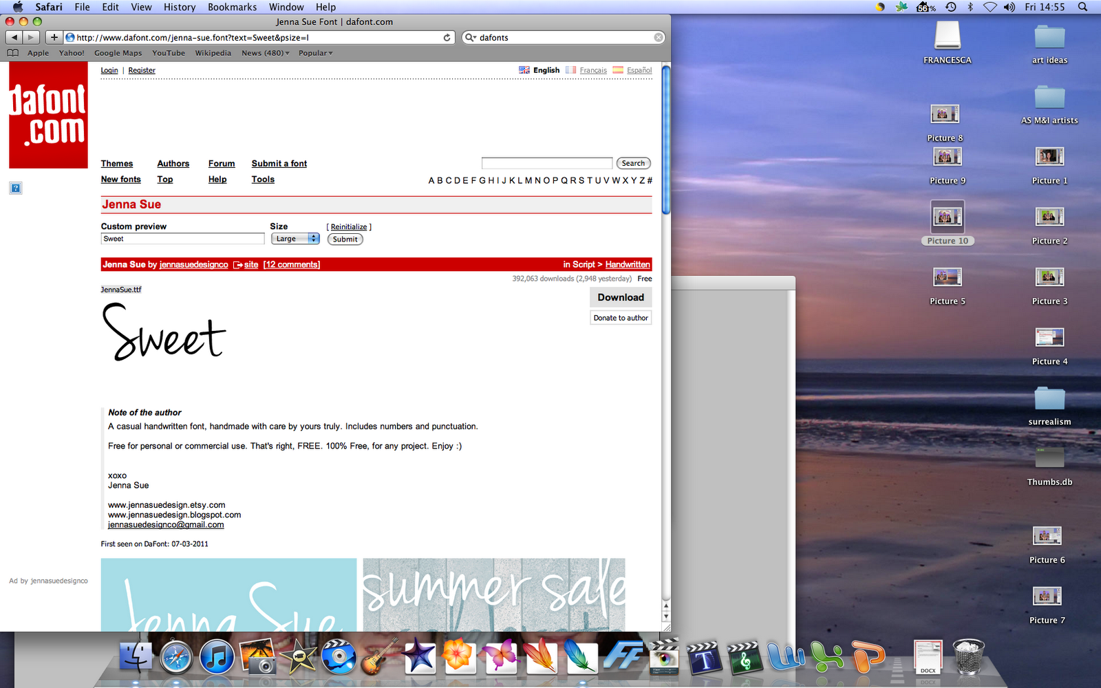
Creating the font for the title on the front cover, we went on dafont.com and used the font called Jenna Sue.
This is a photograph to show Zoe and I creating our CD Digipack.
This is my second draft, i like the purple pastel background with the font of the text. But the logo dint fit with the background, it stands out too much - its too in your face like the first draft it doesn't work.
This is s screen shot of me sorting out the text, I wanted to look like it was placed there for a reason and that it had a meaning. That it was just placed there for no reason. I added a drop shadow and added an outer glow. this has given the text a more importance. I have also moved the logo and faded the edges, but it still looks out of place.
Moving the text and tilting it made it have more of an importance on the cover.
Zoe and I wanted the logo to be on the cover so I tried it as the background itself. It doesn't work quite work, it looks like its been put there just for no reason at all. I kept the text and the group photo in the same place as they fit perfectly. There is a gap in the top left corner which doesn't look right either.
This is a screen shot of me getting the text I had used previously for the name of the song. I thought this would be a good item to fill the gap in.
I have tried the background as black, which I like a lot this give is a more edge to the cover and also make it look more realistic as a cover. The Wonderland have a black background on there album cover, so it matches with the genre. The text stands out which gives the CD cover have more meaning.
This is a screen shot of the text has its outer glow to make it more bolder and give it an importance against the black background.
Here I have added an heart as the 'i' is alibis. this is effect as this helps to bring it more down to a Pop CD cover. This also makes it more girly as it is a sweet bold colour and also its sweet alibis.
Comparing the two covers, we both had a disagreement. I liked the black one more and Zoe liked the purple one. She said that the black one is too dark for a pop CD cover, and the purple one was more bright. I told her that the logo doesn't work on the purple one. I said that the image on the purple one looks like it has just been pasted on there for no real reason, whereas the black one looks like it has a purpose. In the end we compromised and i added the text from the black one on to the purple one without the logo, Now i like the cover more than the draft before.
The image had to be edited as the background had object that were unwanted. I used the burn tool to remove them. It also makes them look like the have a purpose sitting there together.
To have the lyrics on the page i decided that i wanted to added a box that was half transparent so you could still see the image behind.
I decided that i really like this image and it didn't have a purpose on the inlays, But it can have a purpose inside the the CD cover, behind where the CD would be.